The Complete Guide to Pencil Shading Techniques
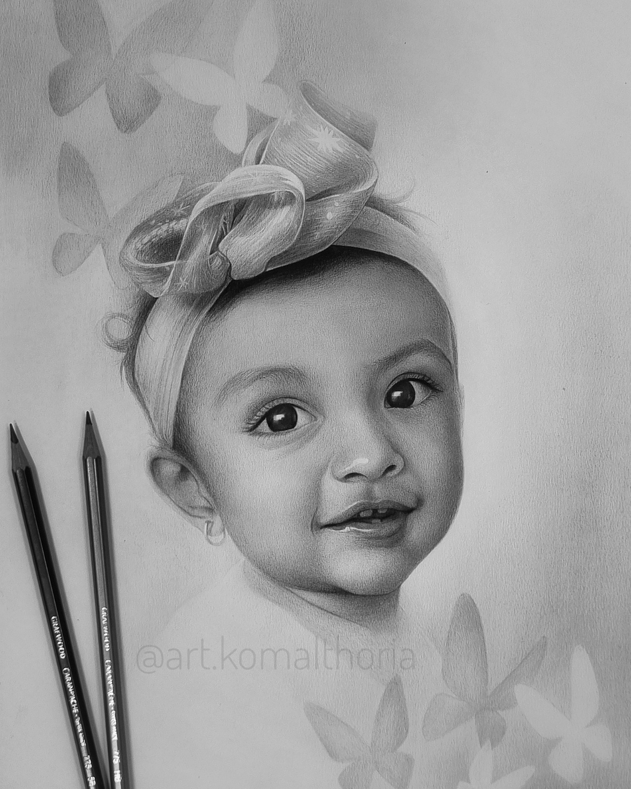
Almost every pencil drawing that stops you in your tracks earns that reaction through shading, not line. A line describes an edge. Shading describes light, and light is what convinces the eye that a flat sheet of paper has depth, weight, and skin. I've been drawing in graphite for close to fifteen years, almost all of it in hyperrealism, and if there's one thing that separates a drawing that looks nice from one that looks alive, it's control over tone.
This guide walks through the shading techniques I actually use and teach, not a generic list lifted from a supply catalogue, but the methods that hold up three hours into a portrait, when values start to matter more than anything else on the page.
Why Shading Matters More Than Most Beginners Realize
New students almost always want to talk about pencils and paper before they want to talk about values. That's understandable. Materials feel concrete, and tone feels abstract. But every realist drawing, mine included, is built on a value scale running from the white of the paper to the darkest mark a pencil can make. Get the values right and a drawing reads as three-dimensional even with fairly loose linework. Get them wrong, and no amount of careful outlining will save it.
Shading is also where an artist's hand becomes recognisable. Two people can draw the same reference photo with identical proportions and end up with completely different drawings, because shading is where personal rhythm shows up: how you build a stroke, how much pressure you use, how patient you are with layers. It's less a technical skill you finish learning and more a sensitivity you keep refining for as long as you draw.
Choosing the Right Pencil Grades for Shading
Graphite pencils are graded on a scale from H (hard) to B (soft), usually running from around 9H at the hardest end to 9B at the softest. Harder pencils hold a fine point and lay down light, precise marks, useful for early construction lines, but frustrating if you're trying to build rich, deep darks. Softer pencils go down faster and darker, with more texture, but lose their point quickly and smudge more easily.
Most shading guides will tell you to build a full set, somewhere around 2H through 8B, and blend between grades to control value. That's a completely reasonable way to work, and if you're starting out, I'd actually recommend it. Feeling the difference between an HB and a 6B under your hand teaches you more than reading about it ever will.
For what it's worth, I work differently. My entire practice runs on a single grade, an 8B, and I control value purely through pressure, layering, and stroke direction rather than switching pencils. It forces a kind of discipline: you learn to pull an enormous range of tone out of one soft, forgiving pencil, and that control transfers to everything else you draw. I wouldn't necessarily start a beginner this way, but once you understand what each grade is doing, experimenting with a restricted set, even just two or three pencils, is one of the fastest ways to sharpen your pressure control.
Tools That Actually Help With Shading
Beyond the pencil itself, a handful of tools make a real difference in how smoothly you can build tone.
Blending stumps and tortillons are tightly rolled paper tools that smooth graphite into soft gradients without the oil your fingers leave behind. A kneaded eraser is softer and more mouldable than a standard eraser, and lifts graphite gently instead of smearing it, which makes it useful for pulling out highlights after shading is already down. Paper matters more than most beginners expect: smoother, heavier sheets, roughly 200gsm and up, hold multiple layers of graphite without the tooth wearing down or the surface pilling. Rough paper can be great for expressive, textured work, but it fights you if you're after smooth, photographic gradients.
And keep your pencil sharp, always. This sounds obvious, but most muddy, inconsistent shading comes from drawing with a dull or rounded tip for too long. A sharp point gives you control over both fine detail and broad tonal fields, depending on how you angle it.
None of this needs to be expensive. A small blending stump, a kneaded eraser, and decent paper will take you further than a large set of specialty tools you don't yet know how to use.
Core Pencil Shading Techniques
Hatching
Hatching is the simplest shading technique: a series of parallel lines, spaced closer together or drawn with heavier pressure for darker values, spaced further apart or drawn lightly for lighter ones. It's fast, and it's a good way to practise consistent stroke direction and pressure control before you complicate things further. The trade-off is texture. Hatching leaves visible linework, which can look intentional and graphic, or messy, depending on how disciplined your spacing is.
Cross-Hatching
Cross-hatching layers a second set of lines over the first at an angle, usually somewhere between 45 and 90 degrees. Each additional layer darkens the value further. It's one of the fastest ways to build deep, rich darks, and it's especially useful in areas where you want visible texture, fabric, hair, background shadow, rather than a perfectly smooth gradient.
Circulism
Circulism builds tone through small, overlapping circular strokes rather than straight lines. It's slower than hatching, but it produces a much smoother, more even value with far less visible linework, which is why it shows up constantly in hyperrealistic portrait work, mine included. The circles should stay tiny and controlled, layered gradually, with pressure easing off as you move from shadow into a lighter area. Rushing this technique is the most common reason it ends up looking patchy instead of smooth.
Blending and Burnishing
Blending uses a stump, tortillon, or even a soft brush to push already-applied graphite into smoother, more even tone. It's useful, but it's also the technique beginners lean on too hard. Over-blended shading loses the subtle texture that makes graphite work look alive, and it can flatten a drawing rather than strengthen it.
Burnishing is related but more deliberate: pressing a blending tool, or a very soft pencil, firmly enough to compress graphite into the paper's tooth, creating an almost polished, reflective dark. It's excellent for the deepest shadows and for areas like pupils or polished surfaces, but it's close to irreversible, so it's worth saving for the final stages of a drawing.
Layering
Layering is less a single technique and more the principle behind almost all convincing shading: build value gradually, in thin passes, rather than trying to reach the final darkness in one go. Each layer gets a chance to settle into the paper's texture, and you keep far more control over the transition between values. Most drawings that end up looking overworked or muddy got that way because darker values were pushed too fast, too early, without enough layering underneath.
Learning to See and Build a Value Scale
Before any of these techniques matter much, you need a working value scale: a mental, and ideally physical, reference for the full range between the white of your paper and the darkest mark your pencil can make. I still have every student draw an actual value scale early on, a strip divided into nine or ten steps, moving evenly from nothing to full black.
The exercise isn't really about the strip itself. It's about training your eye to translate what you see into a specific tonal step, instead of a vague impression of "kind of dark" or "sort of light." Once that translation becomes automatic, your shading decisions get faster and far more accurate, because you're comparing values against each other constantly as you draw, rather than guessing at each one individually.
Pressure Control and Smooth Gradients
smooth gradient, graphite that transitions from dark to light with no visible steps or lines, comes almost entirely from pressure control rather than any particular tool. The fastest habit for building this is drawing gradient strips: heavy pressure at one end, easing off gradually in small increments, until you reach bare paper at the other end. Do this daily for a few weeks with a single pencil, and your hand starts to develop a real feel for the difference between, say, twenty percent pressure and twenty-five.
A light touch, held consistently, is usually more useful early on than a heavy one. It's much easier to darken an area that's too light than to lighten one that's already too dark, so building shading up gradually, checking values as you go rather than committing early, will save you from most of the corrections beginners end up fighting.
Common Shading Mistakes I See Constantly
After years of teaching, a handful of shading mistakes come up again and again.
Skipping the value scale is the most common. Jumping straight into a drawing without any sense of relative value almost always produces flat, low-contrast work, even when the linework itself is accurate.
Blending too early is a close second. Blending before you've built up enough graphite smooths away detail you haven't drawn yet, and it's very hard to add convincing texture back on top of an area that's already blended.
Working one area to completion before starting the next causes problems too. Shading a single section fully dark while everything else stays untouched makes it almost impossible to judge how that area relates, tonally, to the rest of the piece. It's better to build the whole drawing up in stages, moving between areas, so every part develops together.
And ignoring the direction of light undoes otherwise careful work. Shading needs a consistent light source. If shadows fall in different, inconsistent directions across a drawing, no amount of technique will make it read as believable.
Why Shading Deserves a Bigger Place in Art Education
Most school art programmes, in my experience, spend far more time on colour and composition than on tonal drawing, and shading in particular tends to get treated as a footnote rather than a core skill. That's a missed opportunity. Shading teaches patience, observation, and the ability to translate what the eye sees into a controlled, deliberate mark, skills that carry over into almost every visual discipline, not just pencil drawing.
Students who build a real foundation in shading early tend to progress faster later, whatever medium they eventually settle into, because they've already trained the underlying skill that every representational medium depends on: seeing and reproducing value accurately. It's one of the reasons tonal drawing deserves a far more serious place in art education than it usually gets, starting from school age rather than as an afterthought later on.
Practicing With Purpose
Technique lists are only useful once they turn into practice, so a few closing suggestions:
Draw value scales and pressure gradients regularly, even after they stop feeling new. They're warm-ups, not just beginner exercises. Study your reference in greyscale before you draw; squint at it, or convert it to black and white digitally, so you're seeing pure value without the distraction of colour. Work from life occasionally, not only from photographs; shading under real, changing light teaches you things a flat photo reference can't. And give a single technique, circulism, for instance, real time before judging whether it works for you. Most techniques feel awkward for the first few weeks and only start to pay off with repetition.
Frequently Asked Questions
What's the best pencil grade for shading? There's no single best grade; it depends on how you want to work. A full range from 2H to 8B gives beginners the most flexibility, since each grade covers part of the value range for you. Working within a narrower range, even a single soft grade like an 8B, is possible too, but it asks more of your pressure control.
How do you shade smoothly without visible lines? Circulism and controlled blending are the two most reliable routes to a smooth gradient. Both depend on layering graphite gradually and easing pressure off steadily, rather than trying to reach a finished value in one or two passes.
What is circulism in pencil shading? Circulism is a shading technique built from small, overlapping circular strokes rather than straight hatching lines. It's slower to execute but produces an even, low-texture value, which is why it's common in hyperrealistic and portrait work.
How long does it take to get good at pencil shading? There's no fixed timeline, but consistent, focused practice, even twenty or thirty minutes a day on value scales and gradients, produces noticeable improvement within a few months. Shading is a physical skill as much as a visual one, so repetition matters more than any single technique.
Final Thoughts
Shading is the part of pencil drawing that rewards patience more than talent. Every technique in this guide is something you can practise today, with whatever pencil is already on your desk, and every one of them gets easier with repetition rather than sudden insight.
If you want a more structured path through this, with direct feedback on your own work rather than general guidelines, that's what the Silver Portrait Course at Pencil Perceptions Academy is built for. It walks through the same value-based approach to graphite covered in this guide, applied to a complete portrait from start to finish.
Originally published August 18, 2026


© 2026 Pencil Perception Academy